
A useful PDF guide does not need complex layouts, custom illustrations, or advanced design software.
It needs one clear result.
It needs practical steps.
It needs a format readers can scan, follow, and use immediately.
This five-minute process turns an idea, skill, or goal into one of the most effective digital action guides: short, focused, and built for movement.
Use it for a business guide, a beginner tutorial, a worksheet, a checklist, or a practical skill guide.
The Five-Minute Workflow
- Minute 1: Define the outcome
- Minute 2: Build the structure
- Minute 3: Prioritize the steps
- Minute 4: Apply simple visual choices
- Minute 5: Run the quality checklist
Start with one reader and one result.
Everything else follows.
Minute 1: Define One Clear Outcome
Do not begin with a blank page.
Begin with a finish line.
Write this sentence:
After reading this guide, [specific reader] will [specific action] within [timeframe].
Examples:
- After reading this guide, a new freelancer will create a simple service offer in 30 minutes.
- After reading this guide, a beginner will prepare their first DTF printing order.
- After reading this guide, a busy professional will build a weekly meal plan in 15 minutes.
- After reading this guide, a creator will publish their first digital product this week.
The outcome should be observable.
Avoid broad goals such as:
- Understand marketing
- Learn about budgeting
- Improve productivity
- Get better at design
Replace them with actions:
- Write a three-line marketing offer
- Create a weekly spending plan
- Schedule the first three priority tasks
- Select two fonts and one accent color
This single decision keeps the guide useful.
It also prevents the most common PDF problem: trying to explain everything.
Use the Minimum Useful Promise
An actionable PDF guide should solve one focused problem.
Ask:
- What does the reader need to do next?
- What information is required?
- What can be removed?
- What would make the result easier to repeat?
Keep background information short.
Keep examples concrete.
Move advanced ideas to optional notes or a future guide.
Minute 2: Build a Simple Guide Structure
Use a five-to-seven-section structure.
This works for digital action guides, lead magnets, paid PDFs, and instant download guides.
1. Cover
Include:
- Benefit-led title
- Specific audience
- Short subtitle
- Author or brand name
- Version date, if relevant
Example:
Launch Your First DTF Printing Order
A practical beginner’s guide to equipment, pricing, and production.
The title should state the destination.
Avoid clever titles that hide the result.
2. Start Here
Explain the guide in a few lines.
Include:
- Who it is for
- What the reader will complete
- What is needed before starting
- The sequence of sections
Example:
Complete this guide to prepare one profitable sample order.
You need a design, blank apparel, transfer materials, a heat press, and a basic pricing target.
3. Essential Context
Add only the information needed to take action.
Explain:
- Why the task matters
- When to use the process
- What to avoid
- What “finished” looks like
Skip long introductions.
The reader should reach the first action quickly.
4. Numbered Steps
This is the core of the guide.
Use a logical sequence.
Each step should include:
- A verb-led instruction
- One main action
- A short explanation
- An example
- A visible result
Example:
Step 1: Choose one customer and one product.
Write the audience, product type, and expected selling price.
Example: “Local gyms, black cotton T-shirts, $28 retail price.”
Do not combine five decisions in one step.
If the reader must pause and ask what to do first, split the step.
5. Worked Example
Show the process in use.
Use:
- Completed sample
- Screenshot
- Sample answer
- Before-and-after comparison
- Short case example
A guide becomes more actionable when the reader can see the target.
6. Checklist or Worksheet
Convert the advice into a usable tool.
Add:
- Checkboxes
- Short response fields
- Tables
- Decision prompts
- Space for notes
The worksheet should help the reader finish the task, not simply reflect on it.
7. Finish and Move Forward
Close with:
- Three key takeaways
- Two immediate implementation steps
- One next action
Example:
Before closing this guide:
- Confirm your customer
- Set your first price
- Schedule one sample order
End with momentum.
Minute 3: Prioritize the Right Steps
A clear guide is not a complete encyclopedia.
It is a path.
Use this priority order:
- Outcome
- Required preparation
- Minimum action sequence
- Proof or example
- Checklist
- Next action
If a sentence does not help the reader understand, decide, or act, remove it.
Use the “Do This Next” Test
Read every section and ask:
What should the reader do immediately after this?
If the answer is unclear, revise the section.
Replace vague instructions:
- Think about your goals
- Consider your audience
- Improve your process
- Create a strong strategy
With direct instructions:
- Choose one 30-day goal
- Write the audience in five words
- Remove one unnecessary task
- List the first three actions
Start every step with a verb.
Useful verbs include:
- Choose
- Write
- Measure
- Compare
- Select
- Schedule
- Calculate
- Review
- Publish
- Test
Limit Each Page to One Job
One page can explain.
One page can demonstrate.
One page can collect answers.
Do not force every idea onto one page.
More content does not automatically create more value.
Clarity creates value.
Minute 4: Apply Simple Visual Choices
Design skill is optional.
Consistency is not.
Use a small visual system:
- One font family
- Two or three font weights
- One accent color
- Black or dark gray body text
- Consistent margins
- Repeated heading styles
- Numbered steps
- Clear checkboxes
- Generous white space
A strong visual hierarchy tells the reader where to look first.
Use size, position, bolding, numbering, and spacing to show importance.
Do not rely on color alone.
This improves readability and supports accessibility. The WCAG 2.1 guidelines also recommend clear contrast and content that does not depend only on color.

Keep the Layout Functional
Use:
- Short paragraphs
- Bulleted lists
- Descriptive headings
- Highlighted callouts
- Simple diagrams
- Clear page numbers
- Clickable links
Avoid:
- Tiny body text
- Decorative clutter
- Long blocks of uninterrupted copy
- More than two accent colors
- Low-contrast text
- Text placed inside images
- Overloaded pages
Design for the screen first.
Check the PDF on a phone, tablet, and laptop.
If the guide may be printed, test it on standard paper sizes such as US Letter and A4.
Use Visuals That Clarify
Add an image when it helps the reader:
- See a finished result
- Identify equipment
- Follow a sequence
- Compare options
- Understand a layout
Use icons only when they clarify an action.
A visual should earn its place.

Minute 5: Run the Final Quality Checklist
Export the guide as a searchable PDF.
Then check every item.
Content
- The title states a clear result
- The target reader is specific
- The first page explains what will be completed
- Every step begins with a verb
- Steps appear in the correct order
- Each step contains one main action
- Examples show what “done” looks like
- Sections end with an immediate action
- The checklist matches the promised outcome
Design
- Headings use a consistent hierarchy
- Body text is readable on mobile
- Contrast is strong
- Pages have enough white space
- Important information is easy to find
- Images include useful alternative text
- Meaning does not depend on color alone
- Page breaks do not split instructions awkwardly
- Tables and worksheets have enough writing space
Technical
- Links open correctly
- The PDF is searchable
- Page numbers are accurate
- Spelling and grammar are correct
- File name is clear
- Version date is included
- The PDF opens in more than one viewer
- The final download works
For an additional design reference, review this PDF design guide from SegMetrics.
Use a Repeatable Page Formula
For each action page, use this pattern:
Context → Instruction → Example → Checkbox → Next action
Example:
Context: A focused offer is easier to price and promote.
Instruction: Choose one customer, one product, and one price.
Example: Local gyms, custom T-shirts, $28 retail.
Checkbox: Offer selected.
Next action: Write the first customer message.
This formula keeps the guide compact and practical.
It also makes future guides faster to create.
Turn Your Knowledge Into a Digital Product
A strong PDF guide can become:
- An instant download guide
- A paid digital product
- A customer onboarding resource
- A printable worksheet
- A lead-generation asset
- A training companion
- A practical skill guide
The format stays simple.
The result stays visible.
The reader always knows what to do next.
That is the difference between a document and an actionable PDF guide.
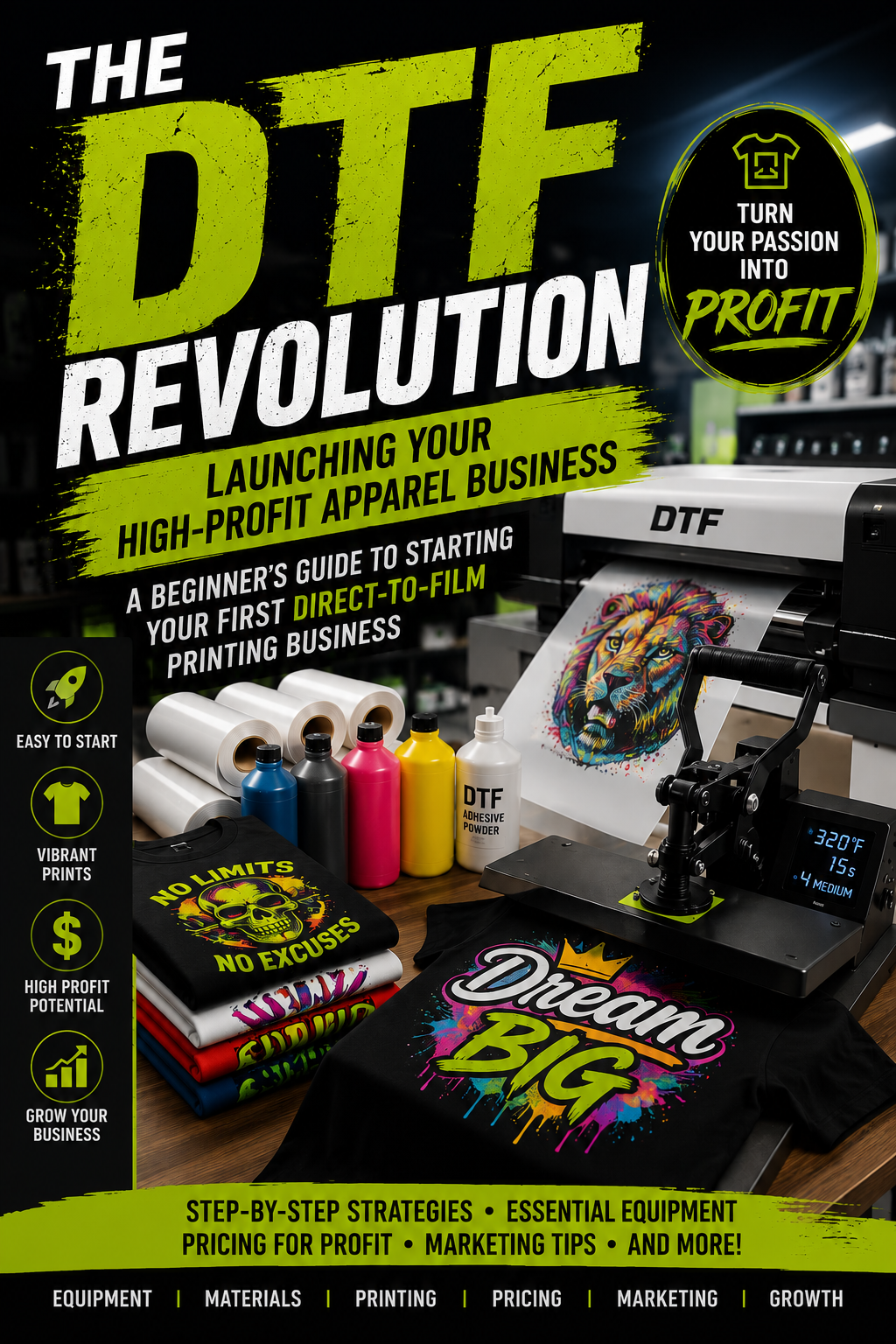
For examples of practical, visually structured digital guides, explore Guide Launch. The DTF Revolution applies the same principle to equipment, production, pricing, marketing, and business growth.
Start Now
Choose one skill.
Choose one reader.
Choose one result.
Write the outcome sentence.
Build the seven-part structure.
Add the steps.
Apply one clean visual system.
Run the checklist.
Export the PDF.
Launch the guide while the idea is still moving.